Tom Scheerer Inc.
New York, NY
www.tomscheerer.com
My notes, taken during a tour of Tom Scheerer's portfolio:
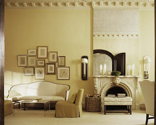
Well, the very first photo is an arrangement of pictures in a style that I like -- meaning under glass, thinly framed, with white or off-white matting. It's a look I like in my own home, and so I always respond to it.
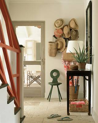
The surfaces are crowded -- not super-crowded, but you know, they have stuff on them. Surfaces look like they're in use. There's a collection of hats; are there other collections? Well, collections of ceramics, collections of small plants, miniature cactus, not sure what those are…. Is this just masses of things? A collection of hurricane candles. There's a collection of birds, paintings of birds.
In fact, there are a lot of paintings of natural items here. I want to say, it's that all of the framed art is a study of something. Not saying that they're all still lives, or anything like that. Just that the art is studious.
Colors are -- it's that the colors are all over the place. Is any color out of bounds? Black maybe. No, there's a room with black walls; it's not out of bounds at all. Okay, this designer is comfortable with neutrals, comfortable with color, with antiques and mid-century. I see a couple of draped beds. Are all the beds draped? No, there's a pair of twin beds, a couple of pairs. I see that done a couple of times. Yeah, I am going to say draped beds, or if nothing else, beds that are capable of being draped. Substantial beds. 

Chandeliers -- there are a couple of fairly traditional chandeliers mixed. Wood tones, could you say anything on that? I think you could say not all the furniture is made out of wood. The furniture is made out of lots of different things: glass, wood, plastic, metal, bent wood. Furniture pieces with textured surfaces. And the mixing is important. The furniture is not just wood and upholstery. The rooms look like diverse furnishings have come to a party -- it looks good.
The prints: There's solids, two-tone print, three colors together, a three-tone print, we're talking about multi-colored prints here. Two or three-tone prints, perhaps multiple of those in a room. We're talking about white -- not just the walls, but white furniture -- which I always feel is significant because given my own tastes, I always feel that a white piece of furniture has no place in my own home, so when I see someone that's using white I notice it. It says something to me about modern-ness.
There's a lot here I like. The studious art, and the mix of materials, are at the top of the list.


0 comments:
Post a Comment