Home Decorator Website
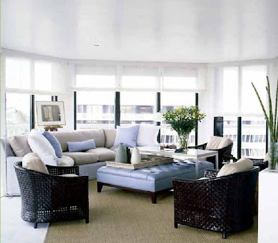
Vicente Wolf was one of the first designers whose work I learned to recognize: Solid colors, lots of white, and large mirrors.
Pale blues. Furniture that really stands out against the white walls. I want to say, not a lot of tailoring to the furniture. By that I mean, unconstructed upholstery, with not a lot of welted edges. Slipcovers even, but no frills, no ruffles.

Seems like there are a lot of loft spaces in his portfolio online, and loft spaces are what I remember over the years. I don't know why that is -- because people think of him when they have loft spaces to do? Or is that just what he prefers?

I want to say dark woods, but I know that's not always true. I do tend to think of rugs in solid colors, though. Not elaborate patterns.


0 comments:
Post a Comment