Rebecca Bradley Interior Design
San Francisco, CA
www.rebeccabradley.com
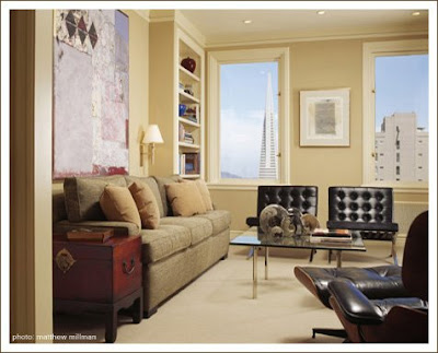
These rooms are bright, with pale colors. There are enough objects on surfaces to make the rooms look lived in.
There are curves, and patterns. Pale carpets, and rugs with geometric designs. The furniture pieces aren't perpendicular to each other. That's picture-taking, but still, it makes the rooms come across as inviting.

There are furniture pieces that look antique, or vintage -- or even if they're not, they look like they might have been, because they don't look new. Like, you could name a time period, name a style. You could say oh, that's French. Or oh, that's English, that table is English.
There are large art works on the walls, but with breathing space.


2 comments:
Oh so happy to find your site. I saw it on Pure Style Home blog. I'm in the process of starting my interior design business so this is a great resource for inspiration and to stay in the know with up and coming people.
Thanks! It's nice to hear from you. Because of you, today is the day I'm figuring out how comments work. I'm trying to make them show up as they do on other people's blogs, but I'm not quite there yet. Give me time, give me time....
Post a Comment