Showing posts with label Art. Show all posts

Tuesday, January 20, 2009

Briger + Briger

Briger + Briger kitchen.  Click to open website.
Briger + Briger

brigerbriger-design.com

In this portfolio, what you'll find is symmetry. Me, when I'm browsing on eBay or Craigslist, sometimes I just search for the word "pair". Pair of what? Doesn't always matter. I just want to see what's out there. I get the feeling these guys shop the same way.

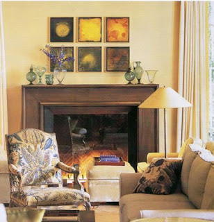
Another thing you'll notice is all the white walls. Almost all the rooms, in fact, have white or slightly off-white walls. These rooms are great examples of how to have colorful rooms, even if you leave the walls white.

And then there's all the sunshine, one of my favorite design elements. This is one of the sunniest collections of rooms I've seen.


Briger + Briger living room.  Click to view larger image.

Slipcovered books.

Briger + Briger bookcase.  Click to view larger image.
Briger + Briger living room.  Click to view larger image.

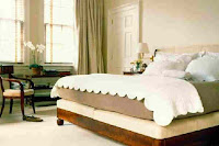
The bedroom that was inspiration for how I arranged the furniture in my own bedroom.

Briger + Briger bedroom.  Click to view larger image.

Cris and Paul Briger have a book available:

Friday, January 16, 2009

Michael Smith

Michael Smith living room.  Click to open website.
Michael S Smith Inc
Santa Monica, CA

www.michaelsmithinc.com

I learned today that Michael Smith has been chosen to decorate the White House living areas for Barack Obama and his family. Pretty thrilling. I came here to update my existing post for him, and realized he and many other designers are on my personal list, but I've never gotten around to adding them here. Let's remedy that for Michael Smith.

As I browse through the rooms in his portfolio, my first thought is that the chairs in these rooms look comfortable, and the beds. I imagine staying as a guest in some of these bedrooms.

The second feature that stands out to me is how often some large-pattern fabric, or work of art, draws my focus. I like that; I get tired of seeing rooms full of nothing but two-tone silhouette textiles and wallpapers.

Michael Smith living room.  Click to view larger image.

Last year, I bought a bookcase similar to the one in the picture below. Smaller scale, but the same color wood, and two glass doors with knobs in the middle -- and because I can't figure out how to arrange anything all by myself, I went looking for pictures of similar things to pattern mine after, and this is what I landed on. So for that reason, I really like this picture.

Michael Smith living room.  Click to view larger image.

Smith has a couple of books available, too:


Tuesday, January 13, 2009

Rebecca Bradley

Rebecca Bradley breakfast room.  Click to open website.
Rebecca Bradley Interior Design
San Francisco, CA

www.rebeccabradley.com

These rooms are bright, with pale colors. There are enough objects on surfaces to make the rooms look lived in.

There are curves, and patterns. Pale carpets, and rugs with geometric designs. The furniture pieces aren't perpendicular to each other. That's picture-taking, but still, it makes the rooms come across as inviting.

Rebecca Bradley living room.  Click to view larger image.

There are furniture pieces that look antique, or vintage -- or even if they're not, they look like they might have been, because they don't look new. Like, you could name a time period, name a style. You could say oh, that's French. Or oh, that's English, that table is English.

Rebecca Bradley living room.  Click to view larger image.

There are large art works on the walls, but with breathing space.

Sunday, January 20, 2008

Timothy Corrigan

Timothy Corrigan great room.  Click to open website.


Corrigan's rooms are full of classical elements such as columns, busts, obelisks, and bas-reliefs. The tables and case goods are period pieces, for example Empire and Biedermeier. I notice right away that nothing is plain. I imagine each piece of furniture being crafted by a guy who said, "Yes, okay, sure, let's make a bookcase, but what shall we do for ornament?" And then he commenced to carve and gild.

From the many rooms in this large portfolio, you can draw lessons for achieving this look -- but I think the first lesson is that it shouldn't be attempted unless you have the budget. Those Empire-styled pieces from Bombay Company, may it rest in peace, won't get you here.

Still, there's a more practically-applied lesson here, too, and that's how to design a room that comes across as formal. My conclusion is that it requires choosing, at all times, items with ornament rather than items that are plain. Let the upholstery be silk, and trust the Scotchgard. Delicate ceramics, not stoneware. Ornate mirrors. Statuettes. Portraits in oil of 18th & 19th century folks. Furniture styles too old to be American. Nothing rustic, nothing country.

Anyway. Don't want to forget to say I love the pine paneling in the libraries and family rooms.

Also, there are multiple examples of a sofa and 4 to 6 chairs surrounding a large coffee table -- a seating arrangement I always like to see in really big living rooms. Back when I tried it for a while in my own home, I remember searching for guidance on how much space to leave between the chairs and table. This site was useful for that.

I recommend clicking the first thumbnail in each gallery, and then using the Next button to navigate. The thumbnails, though large, don't do the full pictures justice.

Timothy Corrigan living room.  Click to view larger image.

Tuesday, January 15, 2008

David Kleinberg

David Kleinberg bedroom.  Click to open website.


There are lots of neutrals and solid colors here. In the living rooms, the walls are mainly white or off-white, with panels or woodwork to add interest. The studies are warmer, with heavier paneling, and some of the rooms shown in magazines are downright colorful.

Throughout, the furniture is substantial. The pictures on the walls, where they exist, are large and hold an important place in the room.

Some of these rooms -- given a chance to spend a week in them -- well, I figure I'd never be able to keep the space uncluttered, but I'd certainly be comfortable while I was there.

This is a nice site, with one of my favorite styles of navigation. Be sure to click the Media & Marketing link, because this is where magazine articles are featured.

Monday, January 14, 2008

Mark Weaver

Mark Weaver dining room.  Click to open website.


The lesson I take from here is all about editing: "Fewer things, well-chosen."

Each piece of furniture is an example of craftsmanship or thoughtful design. The same is true of the many statuettes that appear throughout the rooms.

You know those articles in magazines, where they ask top designers to give advice to everyday folks trying to make their own homes beautiful? More than once I've read advice to throw out the crap, begin with inexpensive utilitarian pieces of quality construction, and then acquire good things, as you can afford them. These rooms show what you can achieve if you take that methodology to its ultimate end.

This designer is featured in Rooms to Inspire: Decorating With America's Best Designers.

Note to self: this is the site with the kitchen design that would work in my house.

Mark Weaver kitchen.  Click to view larger image.

Sunday, December 30, 2007

Miles Redd

Miles Redd living room.  Click to open website.
Miles Redd, LLC
New York, NY

www.milesredd.com

Miles Redd dining room.  Click to view larger image.
Miles Redd porch.  Click to view larger image.
Miles Redd living room.  Click to view larger image.
Miles Redd dining room.  Click to view larger image.
Miles Redd living room.  Click to view larger image.
Miles Redd dresser.  Click to view larger image.