Thursday, January 22, 2009

Kathryn Ireland

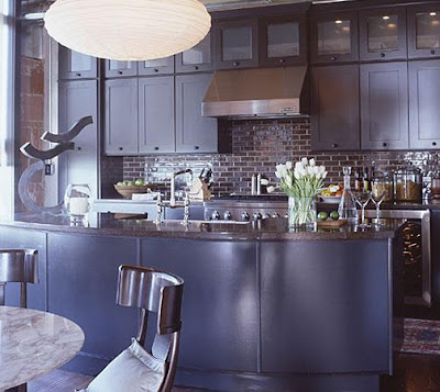
Kathryn Ireland dining room.  Click to open website.
Kathryn M. Ireland
Textiles & Design

Santa Monica, CA

www.kathrynireland.com

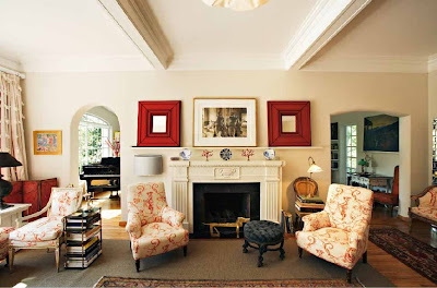
This portfolio is full of great examples of using color against white walls.

Fabrics are quilted, or else (because of their flat weaves) look as if they're candidates for being quilted. This, along with the not-overly-ornate furniture, makes the rooms look clean, casual and comfortable.

Kathryn Ireland living room.  Click to view larger image.

Drapes are mostly hung straight, letting maximum light into the rooms.

Kathryn Ireland bedroom.  Click to view larger image.

My favorite feature of these rooms is the height and mass of the lamps, which are taller and larger than what I usually see when browsing designer portfolios.
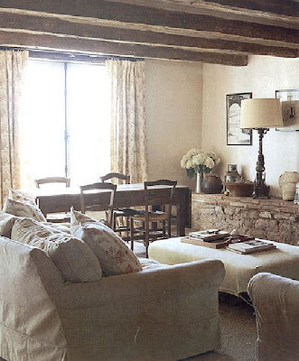
Kathryn Ireland living room.  Click to view larger image.

Wednesday, January 21, 2009

Ann Brown

Ann Brown entry hall.  Click to open website.
Ann Brown Interiors
San Francisco, CA

www.annbrowninteriors.com

Ann's portfolio is large, and some of the designs are older, which makes them valuable for studying to see what still works today. With kitchens especially, I like to do this.

Ann Brown kitchen.  Click to view larger image.

In the bedrooms, the focus is on fabrics. The beds are heavily dressed.

Ann Brown bedroom.  Click to view larger image.

I like the living rooms with simple window coverings best, but there are other examples in her portfolio where the window treatments are more elaborate.

Ann Brown living room.  Click to view larger image.
Ann Brown dining room.  Click to view larger image.

Tuesday, January 20, 2009

Eric Cohler

Eric Cohler living room.  Click to open website.
Eric Cohler Design
New York, NY

www.ericcohler.comEric Cohler bedroom.  Click to view larger image.
Eric Cohler kitchen.  Click to view larger image.
Eric Cohler living room.  Click to view larger image.
Eric Cohler stairway.  Click to view larger image.
Eric Cohler living room.  Click to view larger image.

Briger + Briger

Briger + Briger kitchen.  Click to open website.
Briger + Briger

brigerbriger-design.com

In this portfolio, what you'll find is symmetry. Me, when I'm browsing on eBay or Craigslist, sometimes I just search for the word "pair". Pair of what? Doesn't always matter. I just want to see what's out there. I get the feeling these guys shop the same way.

Another thing you'll notice is all the white walls. Almost all the rooms, in fact, have white or slightly off-white walls. These rooms are great examples of how to have colorful rooms, even if you leave the walls white.

And then there's all the sunshine, one of my favorite design elements. This is one of the sunniest collections of rooms I've seen.


Briger + Briger living room.  Click to view larger image.

Slipcovered books.

Briger + Briger bookcase.  Click to view larger image.
Briger + Briger living room.  Click to view larger image.

The bedroom that was inspiration for how I arranged the furniture in my own bedroom.

Briger + Briger bedroom.  Click to view larger image.

Cris and Paul Briger have a book available: